
Think Tank By LVS-Architecture

Diseñar una forma de convivencia de la comunidad, no solamente una tienda
Diseñar una forma de convivencia de la comunidad, no solamente una tienda
The architecture between the product, the route and sensory stimulation in the supermarket
HEB
From the gastronomic prototype to the space system of HEB Mexico
Field research, interior design and implementation manuals for supermarkets
Luis Othón Villegas Solís
LVS Architecture Mexico
Project developed between 2017 and 2023 Application documented until 2025 Text revised in 2026
How can a supermarket chain organize the relationship between product, information, and movement without turning each store into a repetition of the same interior?
Between 2017 and 2023, we developed a process for HEB Mexico that began in the food courts of Valle Oriente, continued with the comprehensive intervention of Market Prime Chipinque, and culminated in manuals for the internal Stone Oak and Core formats. These three stages were not isolated projects. Each one expanded upon the previous one: from the operation of a group of restaurants to the organization of an entire store, and then to a system capable of adapting to different regions and implementation conditions.
The work began with repeated visits, tours, observations, and conversations with the HEB teams. We found a store subject to several simultaneous demands. The product had to be visible; the promotion, to change quickly; the departments, to maintain a stable presence; and the facilities, to descend from a roof with little capacity to support additional loads. The architecture had to organize these demands without obscuring the diversity of the offerings.
The project transformed field research into spatial decisions, prototypes, and technical documents. Its main contribution lies in this sequence. Perimeter strips, frames, roof changes, focused lighting, and material rules first emerged as responses to observed problems. Later, they were written as criteria for new projects.


Before designing, it was necessary to follow the route
Initial visits revealed that the difficulty in finding one's way around wasn't due to a lack of information. Instead, promotions, prices, department names, graphics, merchandise, lighting, and fixtures all vied for attention in the same field of vision. Some temporary displays were more prominent than the elements designed to organize the store.
Observing people allowed us to identify where conflicts arose. Users slowed down to locate a department, changed direction, or asked an employee for directions when the boundaries between areas were unclear. We didn't conduct an experimental wayfinding study or measure stress. We simply observed and documented the information using videos and photographs. This information also helped us understand that users' routes served as evidence for the project's solutions and showed which relationships required a more stable hierarchy.
Using a study by Rosenholtz, Li, and Nakano on visual saturation as a reference, we identified problems such as crowding, masking, and searchability. This reference, along with research by Michael O'Neill, allowed us to show that the complexity of an architectural layout affects wayfinding accuracy and that signage alone cannot correct a confusing configuration. This background information does not confirm an effect at HEB, but it clarifies why adding another sign would have been an insufficient solution.
We began by separating layers. We determined that one strategy should be the introduction of a configurative design for the canopies, like perimeter bands that would create continuous backgrounds; the use of signage elements within frames that would serve to identify each department's area; we also introduced some changes in canopy height that reduce the apparent scale of the building; and the lighting focused attention on activities and products. The position and section of this perimeter band (design strip), along with the clarity of the signage, began to communicate each department's zone/area correctly and harmoniously.
The prepared food revealed another store.
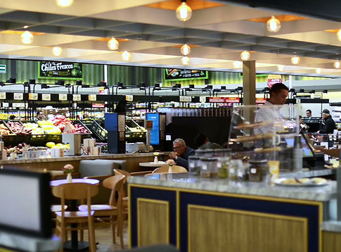
Valle Oriente was the first project to be completed. The commission focused on Bistro, Antojos, Cafecito, SushiYa, Conexión con el Chef, and their support areas. We compared location alternatives and five zoning schemes. From the outset, we treated visibility from the entrance, the relationship between preparation and consumption, staff circulation, odors, and facilities as operational variables.
Working in the food court revealed that a supermarket doesn't operate at a single pace. Some customers browse the entire store, others buy takeout, and still others arrive exclusively during office hours. In Chipinque, the peak time was between noon and 1 p.m. There weren't enough tables, and customers lingered after their meals, keeping the few available tables occupied.
The solution was to enlarge the dining room and organize service with a single-file line. The furniture was arranged in zones based on how long customers stayed. Tables for two and four people, along with long benches, allowed for more leisurely meals. The 1.10-meter-high counters, with wooden stools that have seats 75 centimeters from the floor and no backrests, were designed for shorter stays. Ergonomics thus contributed to the dining room's capacity without imposing a single way of lingering.
During the project, the increased turnover coincided with a reported increase in prepared food sales. We do not have comparative data to attribute the change to the furniture, the expansion, or the single-file seating. What we were able to document was the relationship between a temporal observation of shorter stays in areas defined by ergonomically designed furniture focused on comfort and a new, more efficient food delivery service
.


From department to single-product approach
When we resumed work around 2019, Market Prime Chipinque changed the project's scope. The intervention encompassed the entire store. Fruits and Vegetables, Bakery, Meat Masters, Meat & Eat, and 800 Mainstreet all needed to be distinct, while still remaining part of the same system.
Awnings and pergolas, perimeter moldings on interior facades, floors, ceilings, and areas delimiting supermarket departments formed recognizable thresholds from the aisles. The interior architecture no longer functioned as an undifferentiated backdrop.
Each department was given its own section, boundary, and material intensity. Continuity did not depend on repeating the same finishes, but on preserving proportions, heights, human scale, and lighting relationships.
Market Prime Chipinque held a special place within HEB Mexico, having been one of the company's first stores in the country. The renovation had to respect that history without turning it into a nostalgic legacy, but instead into a fresh, contemporary concept.
The project drew on a narrative of traditional markets, supply warehouses, and wooden pergolas, offering concrete solutions for scale, roofing, and product display.


The awnings couldn't have weighed as much as they appeared to.
The perimeter structure of the store's facades limited the load the suspended elements could carry. The canopies, beams, and pergolas, which visually evoked wood or steel, could not be built with the mass those references suggested. The installations descending from the roof further reduced the available space.
We developed mockups using molded polyurethane foams, plastic systems, and printed finishes. The prototypes weighed about seven or eight kilograms per square meter, well below the project's seventeen-kilogram limit. The pieces maintained volume and presence from a distance while weighing significantly less.
A rule limited material substitution. Everything that could be touched had to match its appearance. A wooden table had to be made of wood; an accessible stone surface could not be achieved through printing. Simulation was reserved for elevated components, where the reading was primarily visual.
The research of Ludden, Schifferstein, and Hekkert on visual and tactile incongruity helps explain this decision. Sight anticipates qualities that touch either confirms or contradicts. At HEB, this relationship transformed a load restriction into a design criterion: distance determined what could be reproduced and what had to retain its material authenticity.
Converting decisions situated in a system
In 2023, the accumulated archive was reorganized into manuals for Stone Oak and Core. Market Prime, Stone Oak, and Core are internal HEB designations. They are not sub-brands aimed at the public. They identify different levels of investment, detail, and complexity within a common structure.
Each department was described using objectives, color palettes, materials, lighting criteria, floor plans, elevations, sections, details, and visualizations. The manual did not establish a single, fixed image. It indicated which relationships to maintain when the site, scale, budget, or regional availability of materials changed.
Stone Oak allows for denser finishes and a more elaborate appearance. Core reduces the repertoire and uses more modular components. Both share departmental hierarchies, frames, lighting criteria, and detail rules. The difference lies in how intensely they are applied.
The manuals continue to be used with revised adjustments in consultation with LVS Architecture. The opening of Stone Oak Juriquilla in Querétaro in 2025 documents this continuity. It does not replace an independent evaluation of the store's performance, but it confirms that the system could be transferred to another location.


From practice to conceptual framework
Mary Jo Bitner's concept of the servicescape helps us understand the store as part of the service, not merely its container. Environmental conditions, spatial organization, and signage influence how customers and employees use the space. At HEB, this framework connects decisions that might otherwise seem independent: wayfinding, displaying, waiting, eating, and shopping.
The project also anticipates several ideas that we later develop in the chapter “Smart Design for Promoting Social Performativity and Interactivity of All the Senses,” published by Routledge in 2025. There, we propose that smart design does not necessarily depend on adding technology. It begins when space responds to action, the body, perception, and its capacity for adaptation.
The relationship is not retrospective in the sense of applying a pre-existing theory. The professional process generated new, concrete questions. How to guide without overwhelming? How to build volume without overloading the structure? How to maintain a relationship of trust between what is seen and what is touched? Academic reflection brought these questions together within a broader framework.
A project that keeps changing
Upon reviewing this work from 2026, we consider its main contribution to be the shift from observation to rule. A difficulty encountered during the journey was transformed into a spatial and design decision; we tested it through drawings, mockups, and the actual construction, then redesigned and revised it to allow variations in intensity without compromising function.
The project does not yet include physiological measurements, controlled monitoring of stay, or a conclusive comparative sales study. Therefore, it cannot yet be presented as evidence that the intervention reduces stress or modified consumer purchasing behavior. However, its evidence lies in the archive of observations and numerical results on increases in average restaurant spend, the applications developed, and the continued use of the design manuals.
For us, designing a supermarket means recognizing that shopping coexists with wayfinding, waiting, eating, and daily work. When architecture establishes clear distinctions in design solutions, consumers no longer depend exclusively on graphic communication. They can orient themselves using design elements without getting lost and easily find the products and services they are looking for.
About the author:
Luis Othón Villegas Solís is an architect and founder of LVS Architecture and Design Belly & Brain. His work explores the relationship between interior architecture, cognition, materiality, and behavior. He authored the chapter “Smart Design for Promoting Social Performativity and Interactivity of All the Senses,” published by Routledge in 2025.
Selected references
Areni, C.S., & Kim, D. (1994). The influence of in-store lighting on consumers' examination of merchandise in a wine store. International Journal of Research in Marketing, 11(2), 117–125. https://doi.org/10.1016/0167-8116(94)90023-X
Bitner, M.J. (1992). Servicescapes: The impact of physical surroundings on customers and employees. Journal of Marketing, 56(2), 57–71. https://doi.org/10.1177/002224299205600205
Huang, J.-Y., Xu, F., & Zhou, W. (2018). Effect of LED irradiation on the ripening and nutritional quality of postharvest banana fruit. Journal of the Science of Food and Agriculture, 98(14), 5486–5493. https://doi.org/10.1002/jsfa.9093
Ludden, G.D.S., Schifferstein, H.N.J., & Hekkert, P. (2009). Visual–tactual incongruities in products as sources of surprise. Empirical Studies of the Arts, 27(1), 61–87. https://doi.org/10.2190/EM.27.1.d
Mattila, AS, & Wirtz, J. (2001). Congruency of scent and music as a driver of in-store evaluations and behavior. Journal of Retailing, 77(2), 273–289. https://doi.org/10.1016/S0022-4359(01)00042-2
O'Neill, M.J. (1991). Effects of signage and floor plan configuration on wayfinding accuracy. Environment and Behavior, 23(5), 553–574. https://doi.org/10.1177/0013916591235002
Pintos, FM, Hasperué, JH, Vicente, AR, & Rodoni, LM (2020). Role of white light intensity and photoperiod during retail in broccoli shelf-life. Postharvest Biology and Technology, 163, 111121. https://doi.org/10.1016/j.postharvbio.2020.111121
Rosenholtz, R., Li, Y., & Nakano, L. (2007). Measuring visual clutter. Journal of Vision, 7(2), Article 17. https://doi.org/10.1167/7.2.17
Villegas-Solís, LO (2025). Smart Design for Promoting Social Performativity and Interactivity of All the Senses. In M. Kanaani (Ed.), The Routledge Companion to Smart Design Thinking in Architecture and Urbanism for a Sustainable Living Planet (pp. 66–76). Routledge.